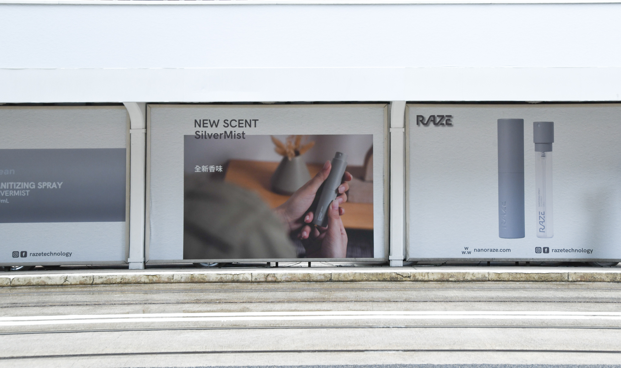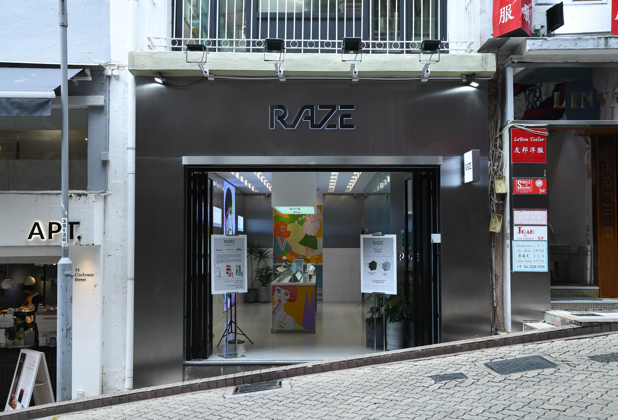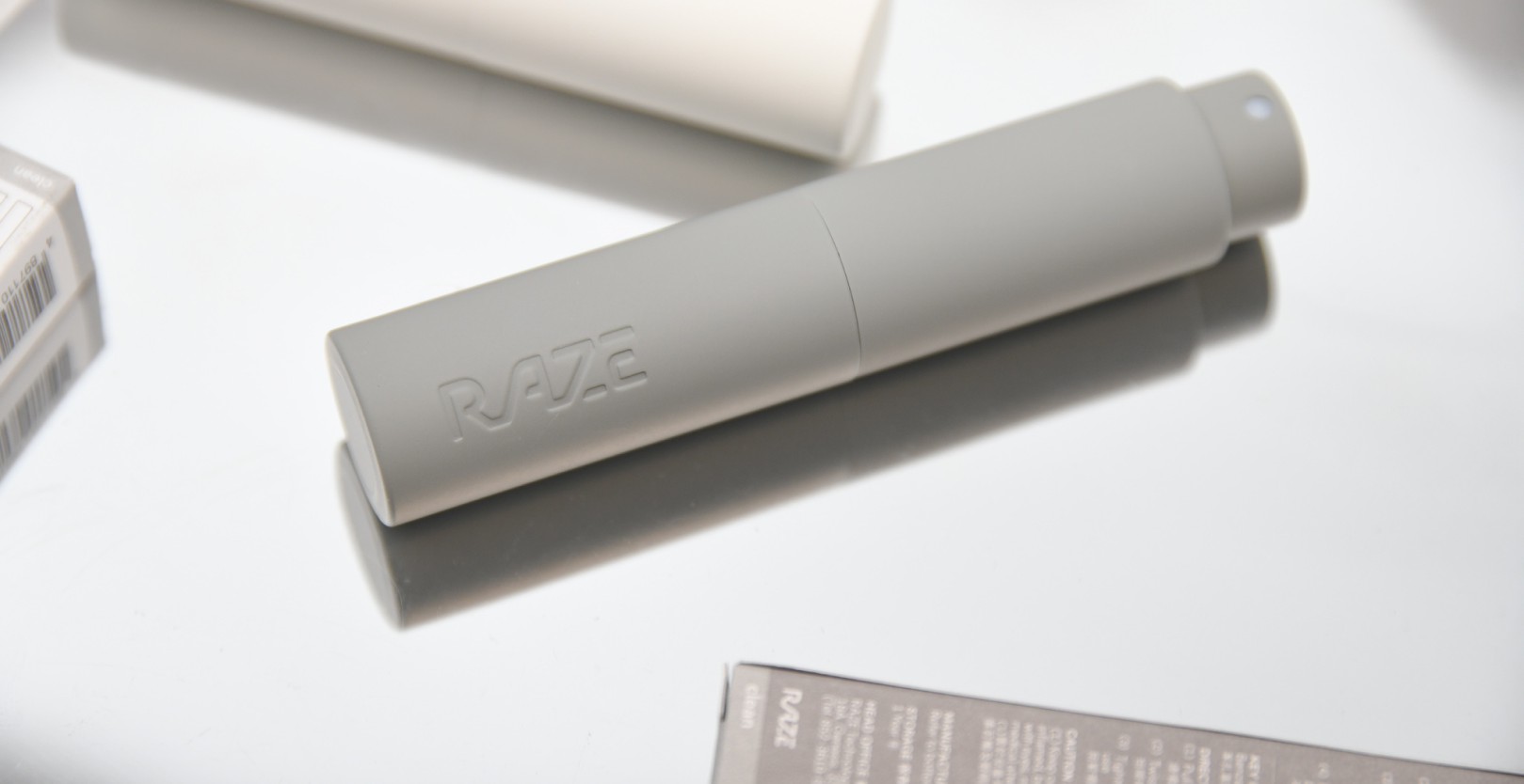
RAZE
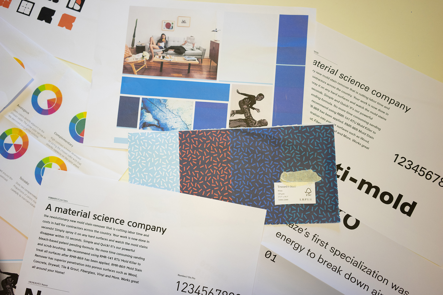
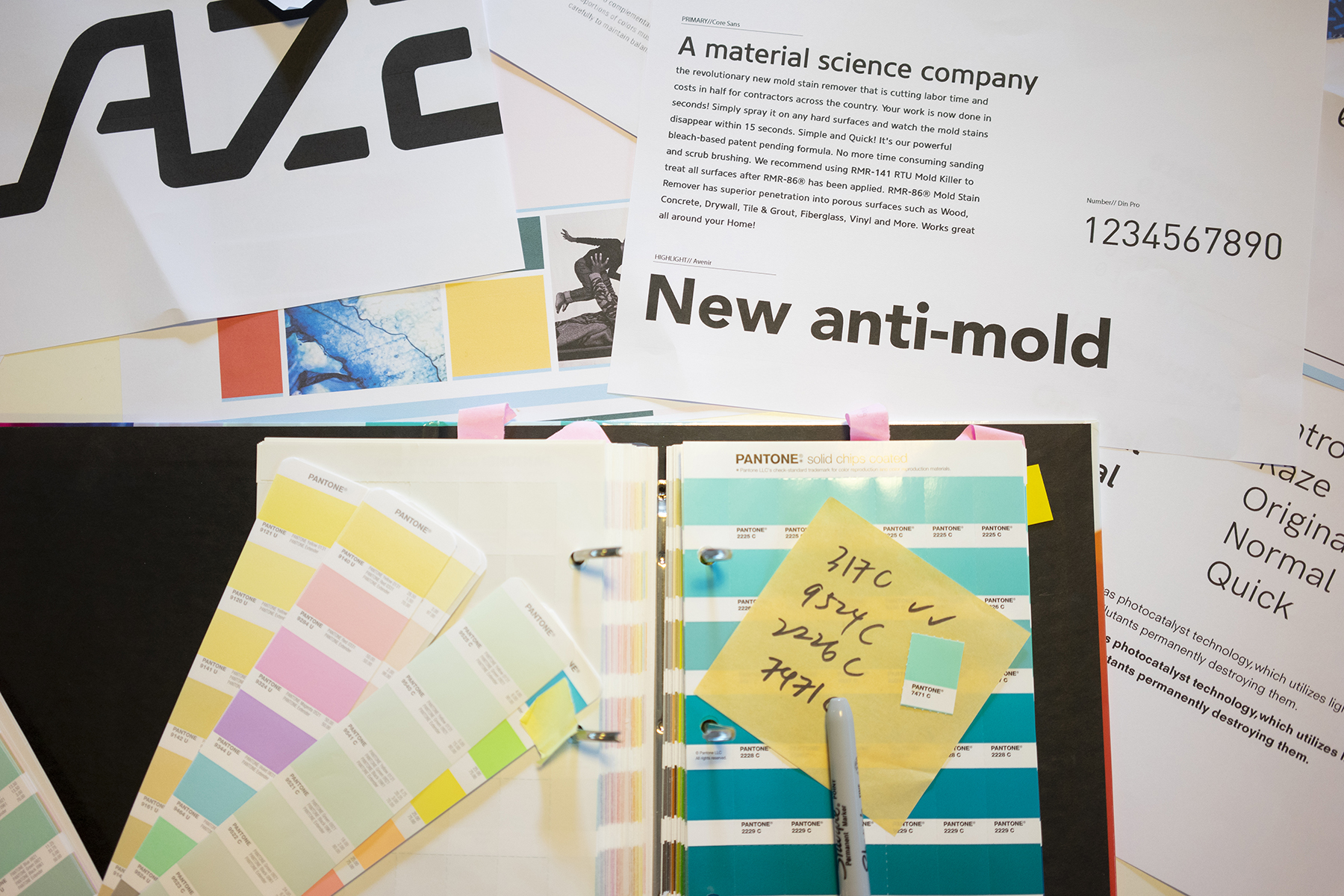
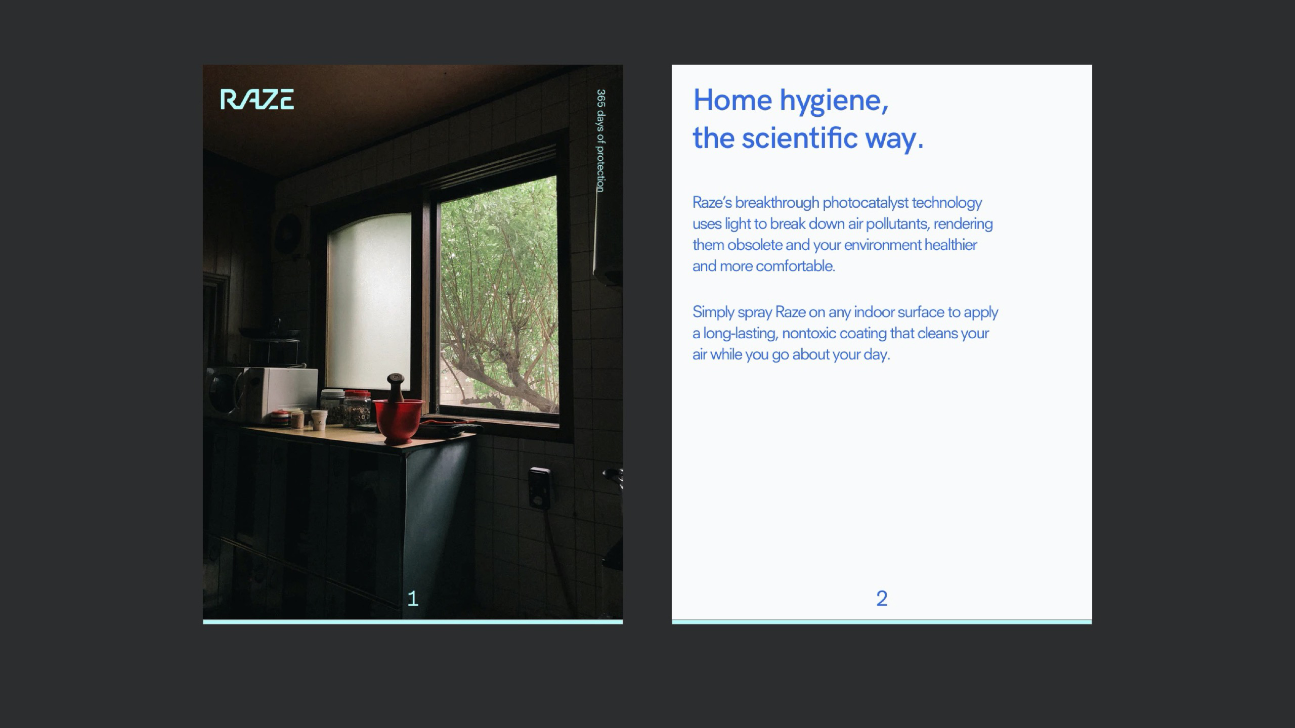
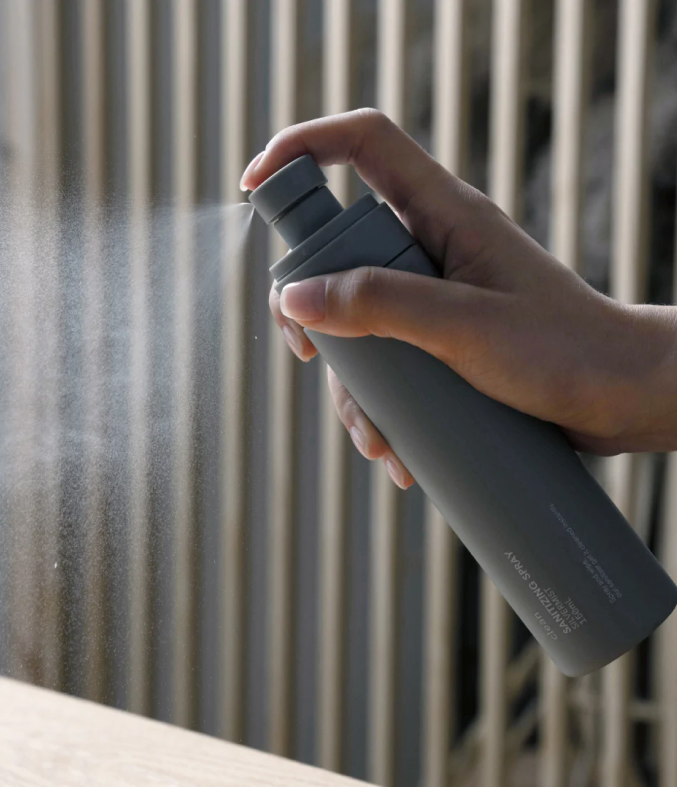
In late 2019, we were approached by RAZE to help create a consumer facing brand for their photocatalyst technology that was launching in everyday household sprays.
The vision for the company was to become a material brand that consumers demand and seek from other products, much like Gore-Tex or Intel. In order to do this, they needed a unique and instantly recognisable brand identity tied to a common household cleaning product in order to build the association of their complex technology with everyday use. What happened couldn’t be predicted and pivoted the traction of the business.
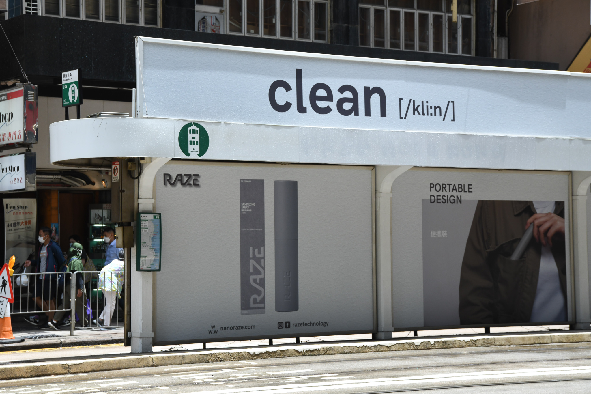
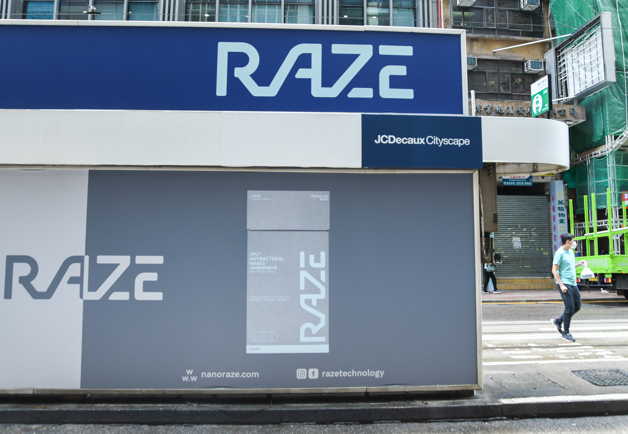
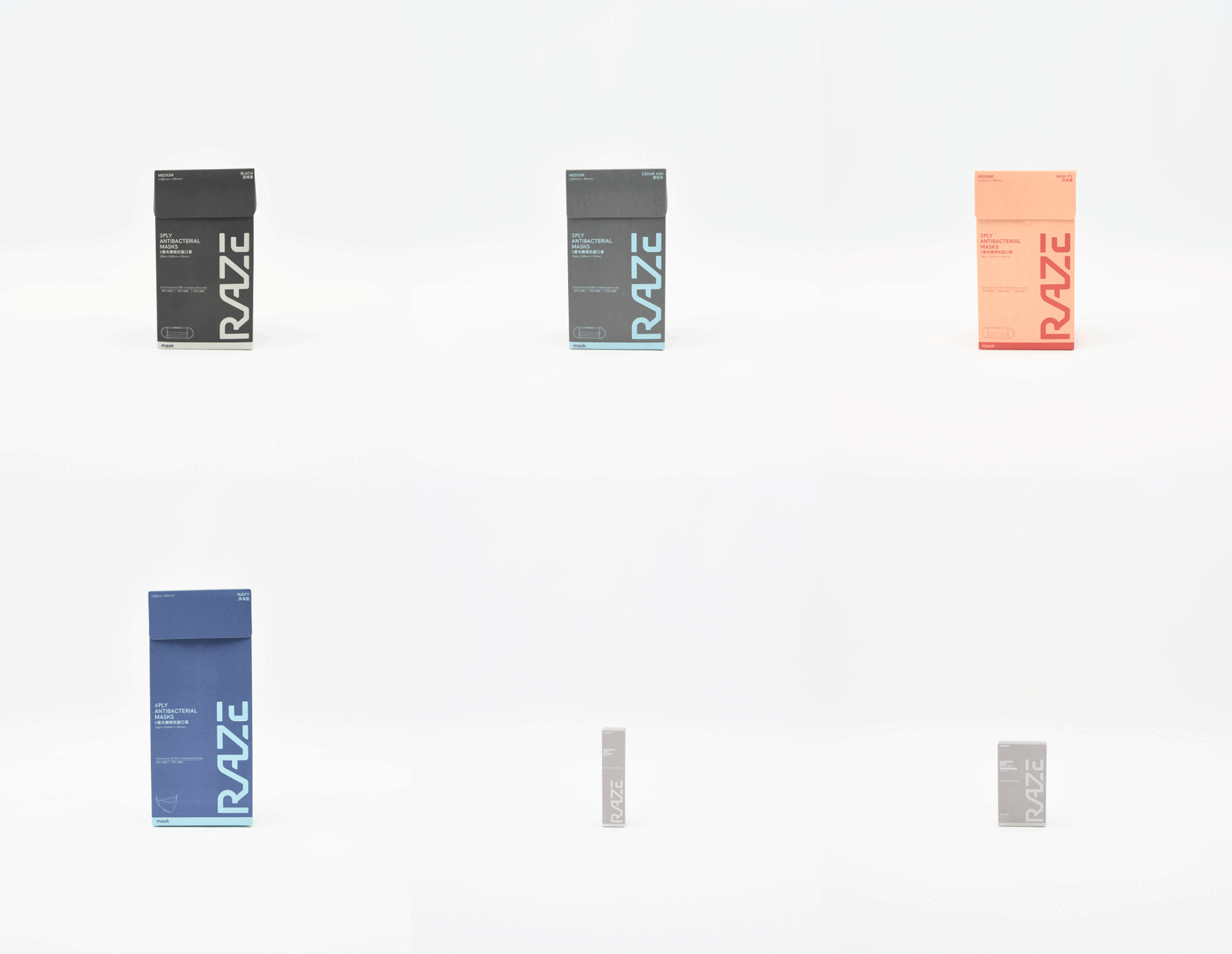
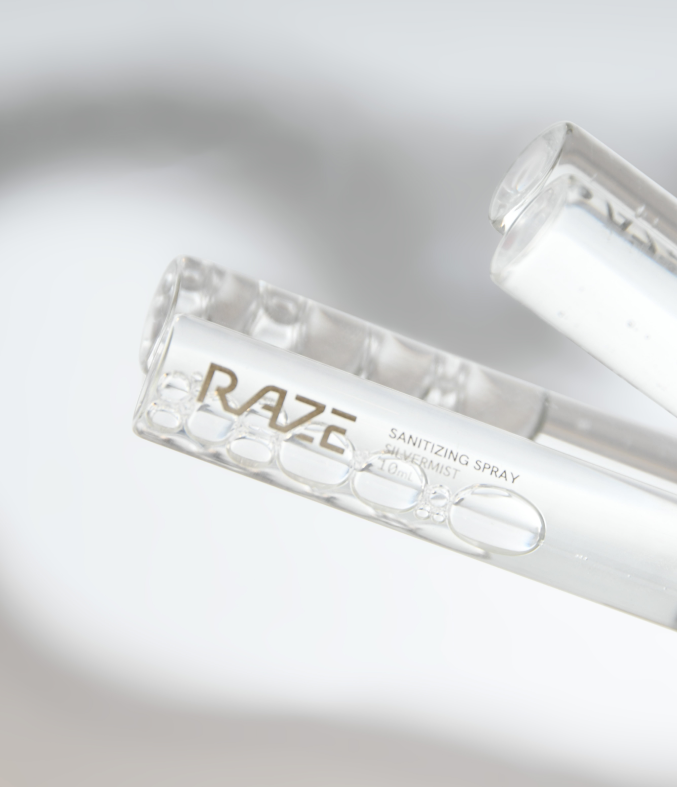
At the time of our first engagement, the world was unaware of the extent of the pandemic that was about to take over. Both us and the RAZE team suspected that it was only a matter of time until the virus crossed over borders, so we worked quickly to develop a solid brand foundation and visual identity in the space of 4 weeks. By the time the packaging was complete and in production, COVID-19 hit Hong Kong and from early 2020 for 18 months, the brand RAZE became a household name, associated with single-use masks, household sanitising sprays, and industrial sanitising across public transport systems.
By 2022, as we settled in to a post-COVID world, RAZE wanted to ensure that the success of the previous 2 years were not lost, and that the brand was future-proof and not just a COVID success story. Going back to the original vision and ambition, we needed to continue to build an in-demand material brand that fit in with modern lifestyles. Though we had created a recognisable brand system, the speed at which it needed to be applied to growing SKUs meant that the logic behind the packaging wasn’t there.
As things started to settle into the ‘new normal’, and RAZE were working on a number of new household SKUs to expand their product mix, we needed to rethink the overall brand system and how it is applied.
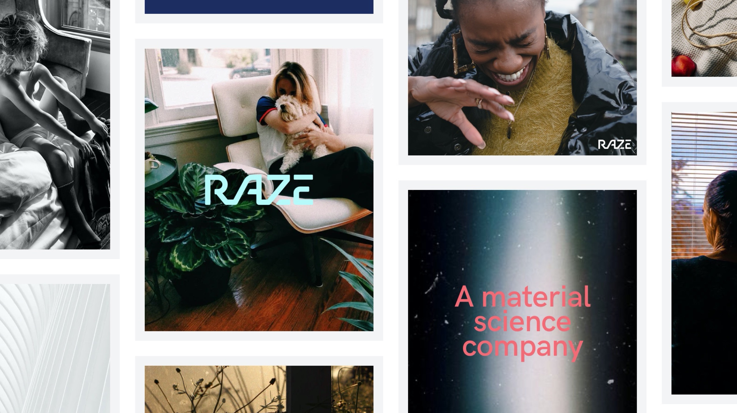
Just as everyday hygiene staples like hand soap and toothpaste are starting to become vehicles for consumers to build on their personal brand, we wanted to ensure that RAZE’s suite of products also reflected a direction that was more in tune with their consumer lifestyles – with a more aspirational, design-driven but practical approach.
The technology behind RAZE is revolutionary and exceptional in its category, and the design should also set the product apart from every day surface sprays.
Process
1
Research and planning
2 weeks
2
Brand workshops
1.5 weeks
3
Brand identity design
2 weeks
4
Art direction
1 week
5
Packaging and collateral design
3 weeks
The trickiest part of this project was how we turn a complex product into something straightforward and approachable, whilst still expressing the technology and innovation side of the brand proposition that sets it apart from competitors.

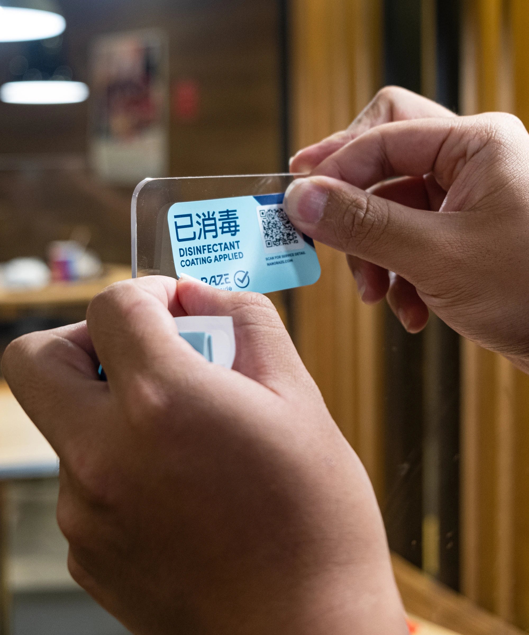
Client reacted quickly when Covid-19 escalated. RAZE Inside stickers seen around the city on sanitised public transport.
Credits
Model campaign photography
Client's own
Store photography
Client's own

