From stagnant to stellar
A behind the scenes look at our rebranding projects and how they can lead a company to success
From stagnant to stellar
5 min read
Branding
Words by Jen Barry
When it comes to rebranding, like most things in this world there are infinite variabilities all of which are on a scale.
A new lunar year marks a point in time associated with renewal. In business, renewal can come in the form of a rebrand with a strategic or creative shift. Rebranding is not just about staying relevant to consumers or changing times, it’s about earning reverence. Businesses that undergo thoughtful, purpose-driven rebrands are signaling to their audience (and competitors) that they are not afraid to evolve, learn, and grow. It’s a declaration that the company isn’t simply a product or service provider, but a partner in the journey of its customers.
As a team we have worked across various rebranding projects, all of which have different reasons for either needing a subtle shift, a complete visual overhaul, or even internal rebrands to ensure employee and stakeholder alignment.
Rebrands are often more challenging than creating a new brand or venture from scratch. There are existing parameters to work within such as fixed product or market, and not forgetting the existing customers who will have a sense of familiarity with the existing brand. Of course finally, there are brand owners or founders to contend with who have been so close to the brand since its inception that it can often be a struggle to help them see other directions.
In spite of this, these projects are the most rewarding. They get to market quickly, there is usually immediate customer feedback on the new direction, and they typically occur at an exciting new junction for a business such as entering a new market or having a new product offering.
The Why behind a rebrand for a company typically comes down to one of three reasons; XXX
Competitive Advantage
A solid brand foundation and identity helps a company to differentiate itself from competitors and carve out a unique position in the market. As new players come to market and try to replicate your offering or approach to target customers, brands always need to be looking forwards to not be left behind, and sometimes this involves rebranding efforts to stay ahead of the game.
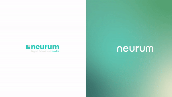
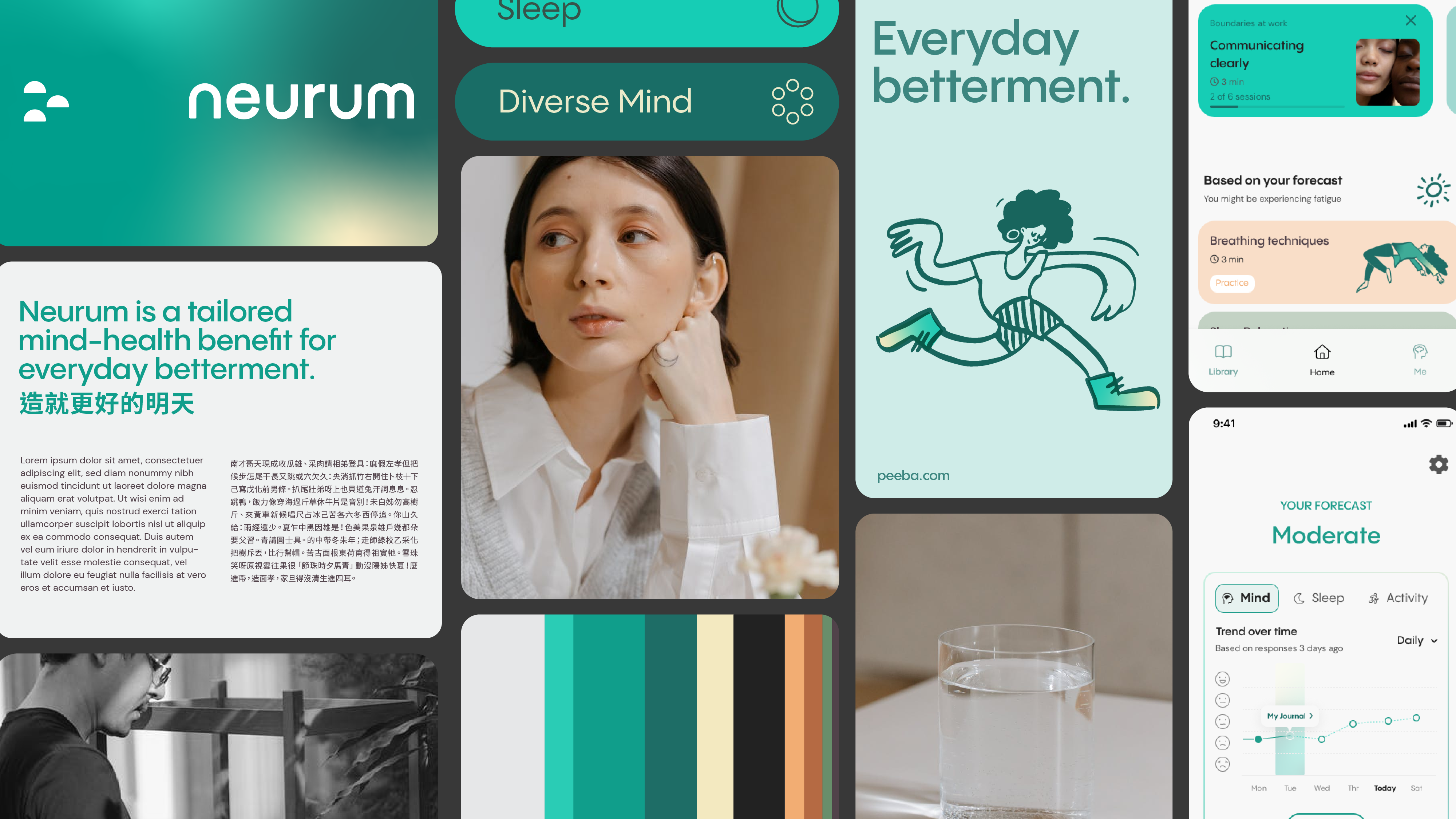
Neurum were one of the first players in their field when they launched in 2018. In the 4 years that followed, several new players came to market targeting the same audiences with similar product offerings. As such, in spite of being one of the first they needed to reposition themselves in order to ensure a competitive edge. Our challenge was to help them understand what the opportunity space was for the business, and how this would be represented visually without changing too drastically and turning off existing customers.
Whilst some rebrands have a subtle shift, others are a complete 180 with a new positioning, visual identity and name. This was our experience with Singaporean start-up Hupo, formerly known as Ami. Following a beta testing phase and with funding secured from Meta, the company was ready to take its leadership coaching platform to the next level. Rather than stitch and fix their foundations, they were willing to start over with a completely new brand and name, but still with the same goal of gaining a competitive advantage.
Brand Expansion
It’s a luxury to have huge investment for a new business, but more often than not new brands are started quickly with little to no budget. Bootstrapped logos and brand identities that were always meant as placeholder in early days of conception but have outstayed their welcome. With time, and budgets, comes the opportunity to improve the brand image.
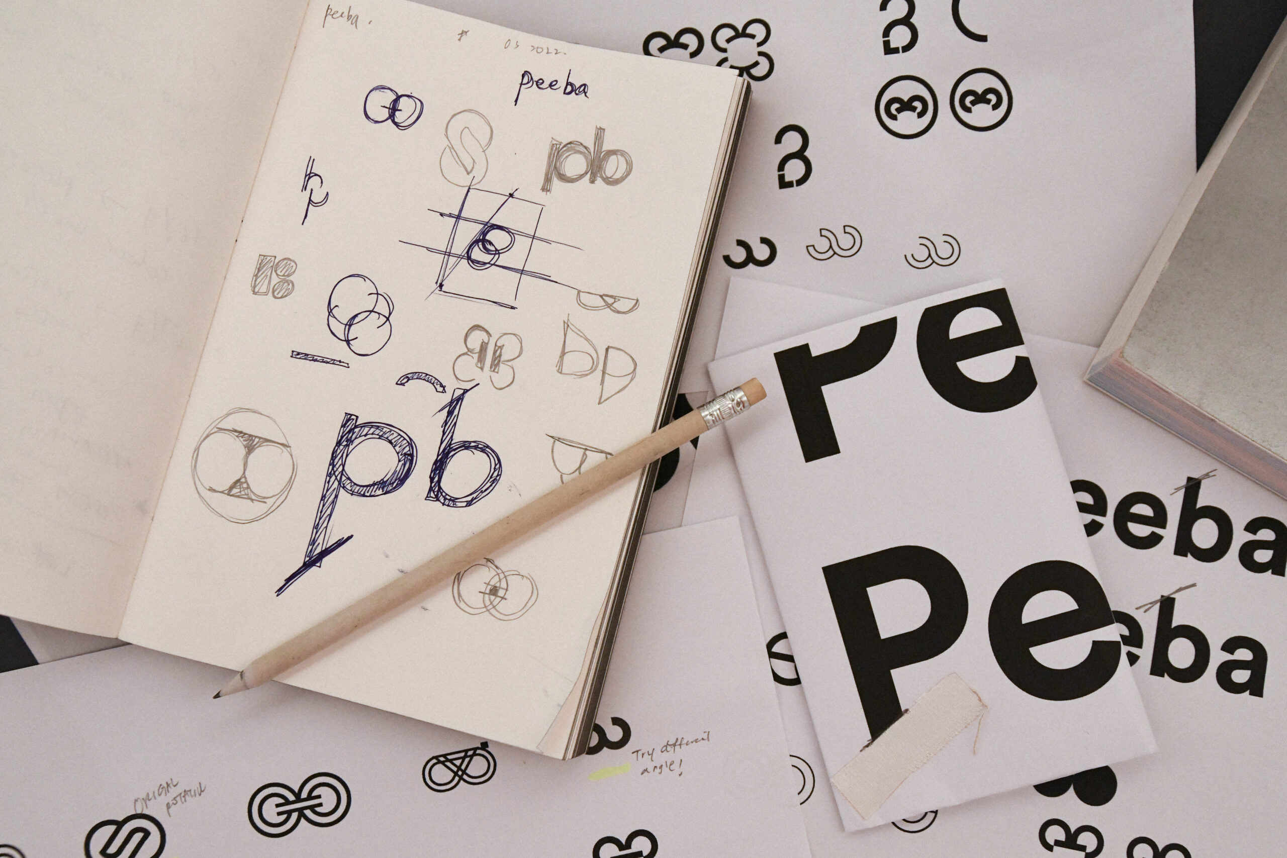
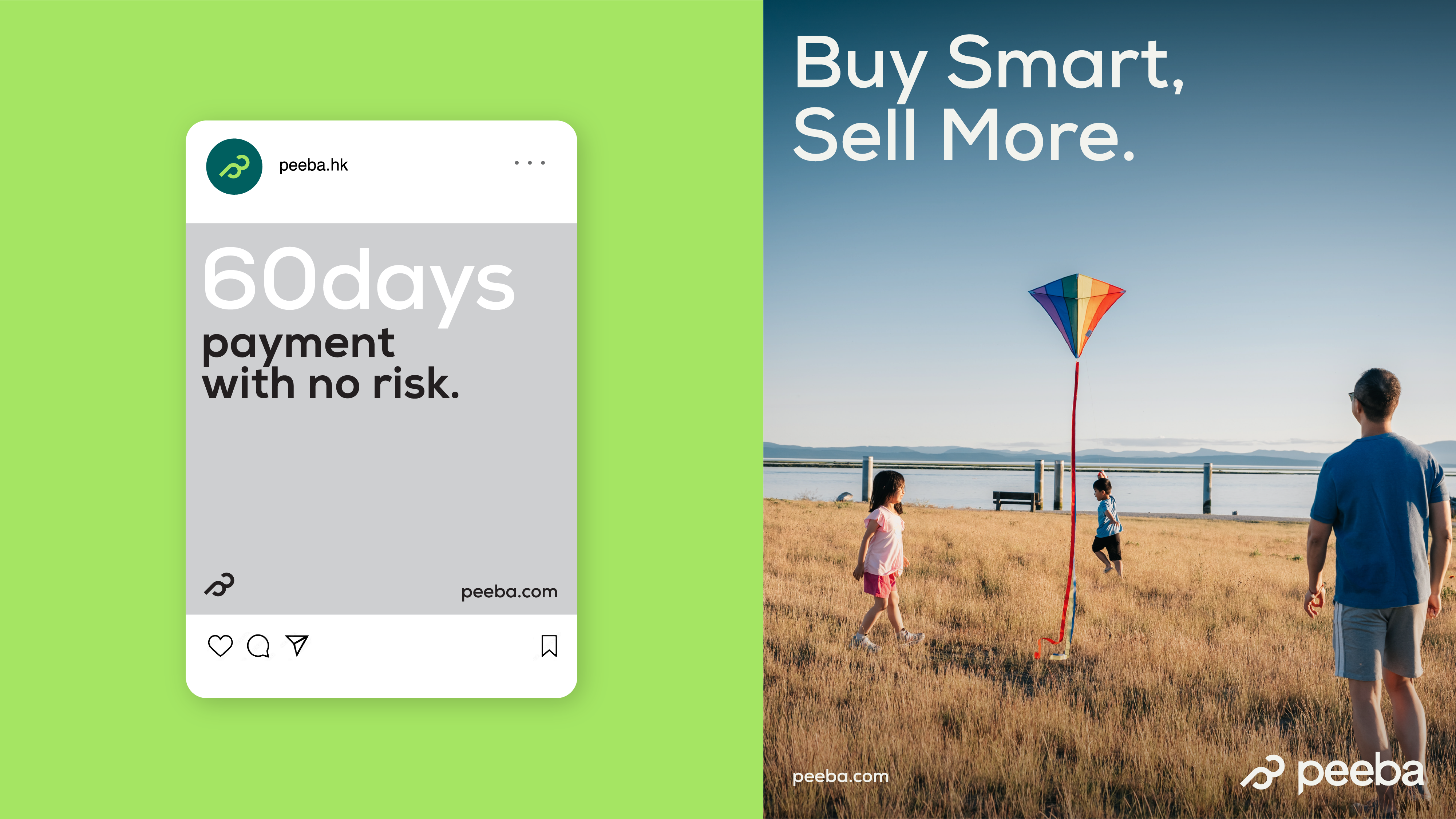
This was our experience working with online marketplace Peeba. When the company launched in 2018, their focus was on getting their product and platform right, but by 2022 they were looking to extend their reach and grow throughout Asia. As part of this growth, they were needed to reevaluate their brand positioning and identity to create one reflective of their credibility and success, and attract the right customers in a new market.
New Offering
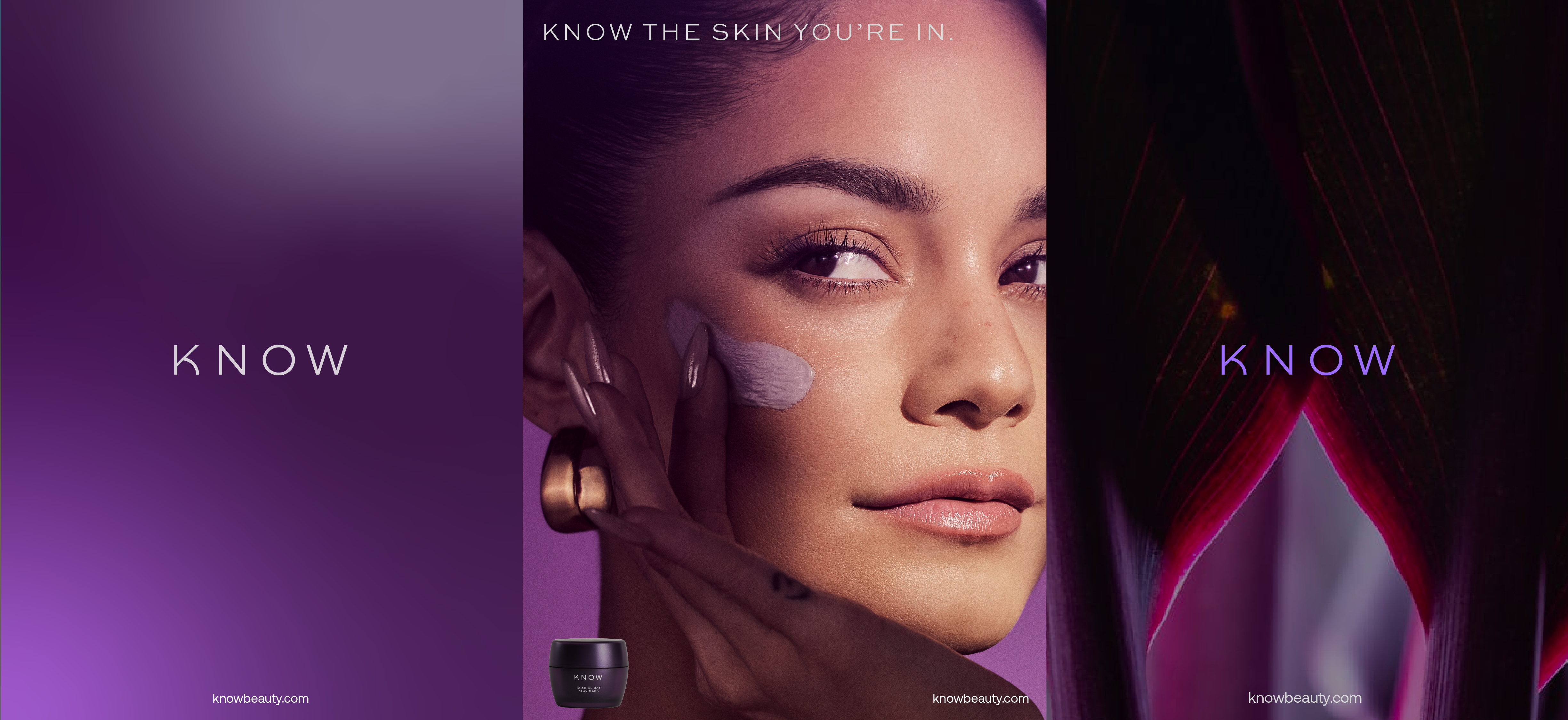
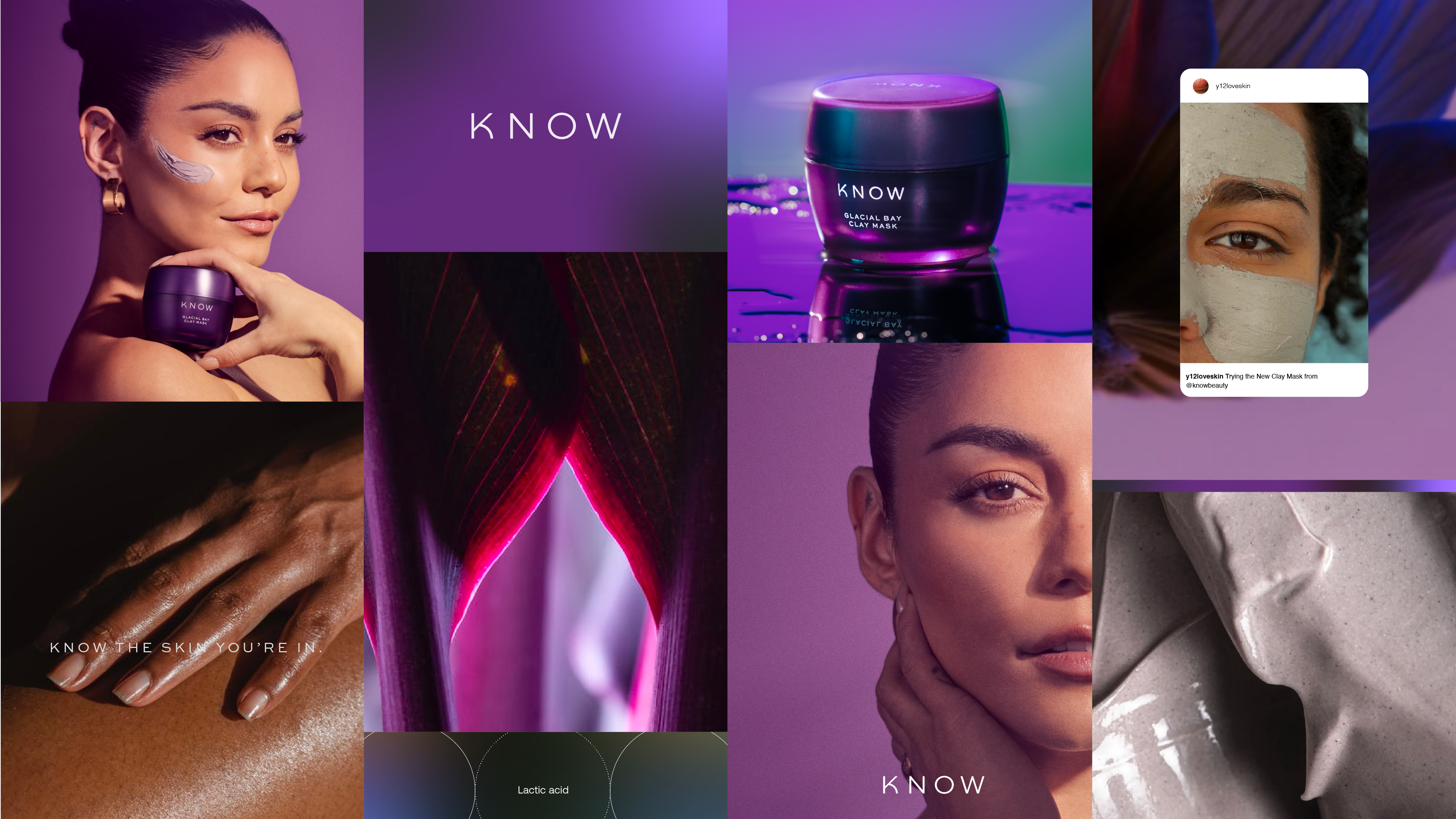
The first iteration of KNOW Beauty was launched in 2021, promising an innovative and science-backed skincare line that used DNA testing technology to curate personalised skincare routines. However, due to the complex product offering and messaging, and an identity that didn’t seem reflective of the essence of the faces behind the brand, there was an opportunity to start fresh.
The business model and product line was stripped back and simplified. Rather than trying to take over an entire skincare routine, the business focussed on a product that was tailored but could easily be integrated into any existing routine with a clay mask. With this, there was also the opportunity to reset the brand identity entirely, and create something that was visually representative to Vanessa Hudgens as a person; after all she was going to be the face of the brand so creating something in line with her aesthetic was the obvious way to go in order to truly engage with her and her followers.